Elegant and Easy on the Eye, or Show-stopping Dramatic, These Paint Combinations will Inspire You10/1/2018 One of the most challenging, yet rewarding, aspects of design is wall colors. I think it’s harder to select paint than wallpaper. One has to consider the room’s orientation to the sun and how to complement the coolness (northern exposure) or warmth (southern exposure). Especially in open plan homes, it’s important to keep the color intensity consistent across rooms or functional spaces, or you risk one color dominating the rest. Here are a few color combinations I’ve recently used in client projects that complement each other beautifully. Hats off to Benjamin Moore Paints. Elegant and Enduring… These are colors your never tire of. Safari is one of my go-to colors; it introduces a warm, soothing yellow that really complements a room with a Northern exposure. It is not a brassy yellow and it works well with the purple finishes and furnishings, which seem to be in demand these days. When I cut Grasshopper back to 50 percent, it loses a lot of its gray tone, and moves towards a pastel green with depth. Old Prairie is an effervescent gray, which I’ve used to good effect with green and navy blue furnishings and finishes.  Safari, AF-335  Grasshopper, AF-415 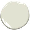 Old Prairie, 2143-50 Easy Does It… I used the following color for clients who were changing from the previous owner’s intense hues. My clients wanted touches of color, not imposing shades or dramatic tones. Theses paints add warmth and interest, yet are fairly neutral.  Ylang-Ylang, AF-305 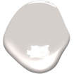 Angelica, AF-665  Ivory White, 925 Dutch Drama… I admit it, the “Girl in the Pearl Earring” movie and now, “The Miniaturist” on PBS, are inspirations for these rich and dramatic paint combinations. They are reminiscent of the deep pigmented hues seen in Renaissance paintings from the Low Countries like The Netherlands and Belgium. You can accessorize these colors with brushed chrome furniture and accessories for a Contemporary look, or with rich wood for a more traditional approach.  Deep Sea Green, 735  Golden Retriever, 2165-30  Caliente, AF-290 Short of painting these colors on your wall, test paint colors by applying them to large pieces of watercolor paper. I usually have several pieces of each color that I move around the room, so I can see how the paint behaves in the day’s different lights.
For more information on how you can choose the optimal paint color for your home, contact me at 215-860-5059, or email me at [email protected].
1 Comment
|
Archives
November 2022
Categories |
 RSS Feed