|
Here’s a culinary Rorschach test to try on your friends: ask them to describe a “small kitchen”. I bet they will imagine a minuscule space with a bulky 30-year-old refrigerator, a tiny sink, and a stove with three oven functions: bake, broil and broken. Happily, they will be wrong and after reading this article, you’ll be able to tell them why. 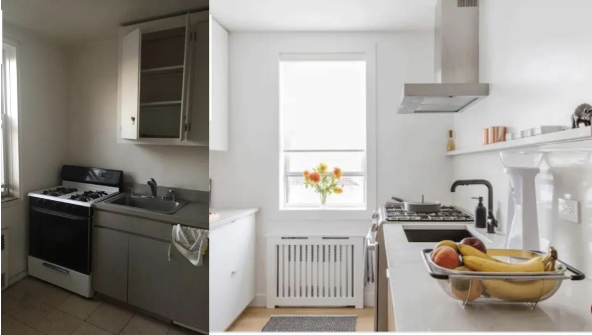 A small kitchen doesn’t imply a dismal kitchen. There are many space-saving appliances, storage solutions, and pragmatic, imaginative designs available to you, as seen in this before and after composite photo. (Photo: www.apartmenttherapy.com) Small kitchens, usually those between 150 square feet to 200 square feet, are common in urban areas, which are growing at a faster rate than other locales. Many times, a primary residence or a pied-a-terre in NYC or Seattle means enjoying the view and sacrificing on the kitchen real estate. Ski bolt holes, beach homes, yachts, and kitchenettes in a gathering room or an owner's suite present appliance challenges that require creative space planning and the right appliances to meet specific needs.  Gathering areas are optimal locations for snack centers equipped with a coffee station and auxiliary refrigeration. (Photo: www.subzero-wolf.com) Several manufacturers have developed appliances to meet the compact kitchen market, incorporating the function, luxury and versatility these venues demand. Scaled-down appliances are available from a variety of retailers--from specialized, high-end dealers to big box stores. And here’s where pragmatism, smart planning and good design come into play. Be realistic about your shopping, cooking and storage habits. For example, are you a three-time a week food shopper? Then perhaps you could forgo a large refrigerator freezer in favor of a narrow column refrigerator/freezer or refrigeration drawer units that will yield more counter space. 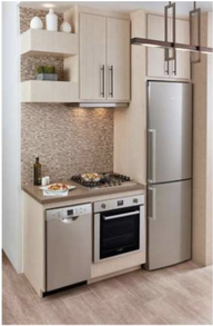 Bosch’s B11CB81SSS 24” wide refrigerator/freezer maintains consistent, cool fresh air throughout the unit, bright LED lighting for maximum visibility and is counter depth. It’s available at Lowe’s. (Photo: www.bosch-home.com) 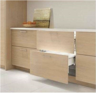 Refrigeration and freezer needs are met compactly with the Sub-Zero ID-30CI. It features magnetic door seals to ensure freshness, soft-on LED lighting, and silent, soft-close features. (Photo: www.subzero-wolf.com) Can you ditch the 36-inch range or larger, instead opting for a 24-inch induction or gas cooktop and a speed, steam or conventional oven below? How about selecting an 18” wide dishwasher, instead of the standard 24-inch width? 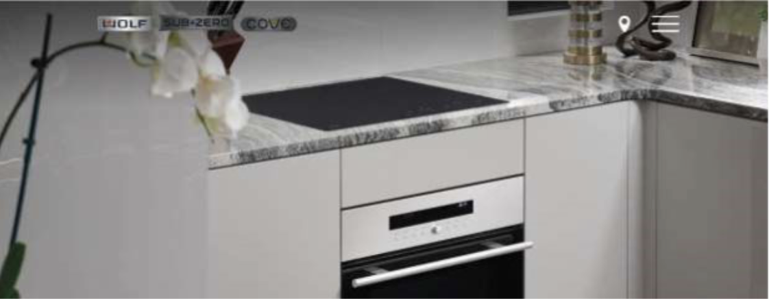 Combine a 24”-wide induction cooktop with a speed, combi, or an induction oven for space-saving yet fully functional cooking. (Photo: www.subzero-wolf.com) Think out of the box when it comes to storage. If you have high ceilings, feature tall wall cabinets or pantries—seldom used articles can go on the highest shelves, leaving the lower ones for items you use every day. Organizational accessories such as spice pull-outs and roll-out shelves conveniently store frequently used items in previously unused or underutilized spaces. Use the insides of doors to mount space-saving accessories such as spice racks. Evaluate every base cabinet for its storage potential. For example, a U-shaped organizer fits around plumbing in your sink base cabinet to store cleaning products that might otherwise clutter another cabinet. 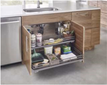 The Rev-a-Shelf 5386-30 BCSCFL-FOG maximizes space around the base cabinet plumbing, fully extends and features soft-close. (Photo: www.rev-a-shelf.com) Keep your cabinets as wide as possible. A kitchen with many small cabinets looks cluttered and cramped. Light-colored wood and painted surfaces take up less visual space and convey the impression there’s a lot of room. Since small kitchens are sometimes located in the center of an apartment, be sure to plan for sufficient undercounter task lighting, as well as for overhead, ambient fixtures. If your space is near a window, or if you can add lighting via a skylight, strongly consider that, too. The takeaway here is that a small kitchen is not a dingy kitchen—it’s a space full of possibilities and an opportunity for you and your designer to exercise incredible imagination and functionality. If you’d like to discuss how I can help you do that, I would love to hear from you! Lyons-Archer Kitchen and Interior Design has provided kitchen, interior and window treatment design for more than 10 years.
I am proud to have created a design firm that offers a unique, curated kitchen design experience. I carry stock, semi-stock and custom cabinetry. My product line includes Woodland and Prevo custom cabinetry, and I provide a boutique, in-home individualized design, purchase and specification process for the discerning client. Please contact me for other services, including bathroom and office design, space planning, couture draperies, window coverings and upholstery. You can reach me at [email protected], or 215-860-5059.
0 Comments
One of my kitchen design mentors would refer to backsplash tile as “kitchen jewelry,” explaining that the best time to select it was after all other finishes were installed. Timing the selection this way gave the designer and client a chance to accessorize, just as we might pick cufflinks to accent a special suit, or a splashy necklace to add “sparkle” to an evening gown. While I don’t necessarily agree with his timing, I do think this season’s new tile offerings can add whimsy, luxurious elegance, and beautiful variety to every kitchen style. Here are my favorite tiles for Fall 2022… "...this season’s new tile offerings can add a touch of whimsy, luxurious elegance, and beautiful variety to every kitchen style." Inspired by Popsicles… These glass mosaic tiles from Daltile come in 1” x 1” or 1” x 6” sizes and in three “flavors:” Lime Glow, Orange Russet and Lemon Popsicle. These are the perfect accessories for contemporary kitchen cabinetry that's finished in a deep black/brown. Or they are the appropriate foil for a retro, white kitchen. 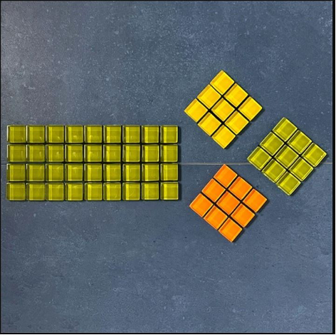 Nifty Fifties… With its Panoramic Porcelain, Daltile delves further into nostalgia with the Urban Farago pattern. Inspired by terrazzo, a composite material that’s been around for ages, Urban Farago is a 6mm material whose application includes solid backsplashes (for that no-grout line backsplash approach, shown here) and as a countertop. This material’s black, white and gray chips beautifully ground the exuberant colors in this kitchen. 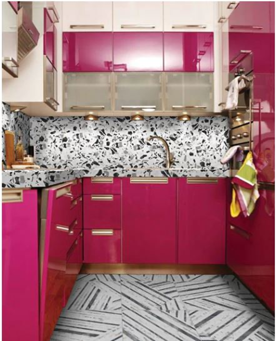 A Nod to Craftsmanship William Morris inspires one of The Tile Shop’s latest offerings called, “Pure Net.” It’s a subtle, 13” square, porcelain tile that softly accents traditional and transitional kitchens. It’s so beautiful that no other accent pieces are needed. Its distinctive yet subtle design will inspire you to tile from ceiling line to countertop with no fear of overwhelming the rest of your kitchen design. 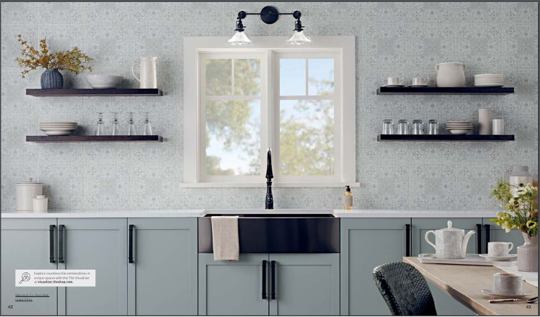 Looks like cement but doesn’t act like it… There is a dizzying amount of information out there regarding the pros and cons of cement tiles. However, I think Garden State Tile's Arista encaustic-like tile negates all the con arguments. While it looks like a cement tile, it is made of porcelain. For you, this means it’s sealed and won’t stain. I love the thought of using these 8-3/4” square tiles in a transitional kitchen with strong colors (think navy or black with brass hardware). 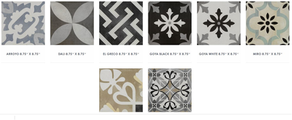 I hope you’ve been inspired to accessorize your new or existing kitchen with this blog. If you would like my assistance, please know my services include kitchen design, cabinetry sales, window treatments, couture window draperies and more.
Please reach out to me with your comments on the blog, or with ideas you’d like me to explore in future articles. I look forward to hearing from you! Lyons-Archer Kitchen and Interior Design has provided kitchen, interior and window treatment design for more than 10 years. I am proud to have created a design firm that offers an unique, curated kitchen design experience. I carry stock, semi-stock and custom cabinetry. My product line includes Woodland and Prevo custom cabinetry, to provide a boutique, in-home individualized design, purchase and specification process for the discerning client. Please contact me for other services, including bathroom and office design, space planning, couture draperies, window coverings and upholstery. I can be reached at [email protected], or at 215-860-5059! Get Smart… New Tech Tools Continue to Reduce Workload, Increase Convenience in Kitchens and Baths6/5/2022 Voice-activated light switches, refrigerators that help you shop, and window glass that changes from opaque to clear (depending on what’s going on in the bathroom) are just some of the capabilities in today’s smart home. While not a brand-new trend, smart home features are increasingly sought by millennials as they become a larger share of the home-buying/renovating consumer population. They are at ease connecting their smart phones with an Alexa-like voice control device to provide home security, control appliances, enhance their at-home sensory experience, organize their shopping, and cut down unnecessary natural resource use. Here are just some of the smart home technologies for you to explore and consider using in your own home. Countertop Projector With this interactive device (developed by Microsoft Home), you control other appliances, scan the thickness of food, get tips on how long to cook items and even project patterns onto food to create platters that look as good as they taste. And since it attaches to the underside of your cabinet, it doesn’t take up any counter space while still improving how you cook, clean and even bake. For more check out the article on this exciting technology by Mike Elgan at Houzz  Image source: https://www.houzz.com/magazine/coming-soon-turn-your-kitchen-counter-into-a-touch-screen-stsetivw-vs~10395231 Smart Refrigerators Refrigerators have changed a lot in the past few decades. What used to be a rather static feature of kitchens around the world has transformed into an interactive appliance that promotes organized family living. Check out the Samsung Smart Fridges here! Smart fridges feature screens allow you to take notes, create grocery lists and even keep track of upcoming events. They come equipped with inside cameras to check what you might need from the store. Many models even have a smart assistant who can help you with ingredient swaps or measurement conversions. 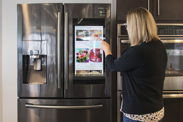 Image source: https://www.digitaltrends.com/home/samsung-family-hub-refrigerator-review/ Smart Trash Can New smart trash cans and recycling bins reduce odors and optimize shopping your shopping trips. For example, trash can attachments, such as the Geni-Can will scan your products and add them to your phone shopping list to let you know what additional items to pick up at the store. Recycling bins will soon be able to scan and sort your items into the appropriate category for proper disposal as well.  Image source: https://www.reviewgeek.com/p/uploads/2019/09/fb5c81ed-6.png Smart Oven Hoods With everything else in your kitchen going digital, it was only a matter of time before oven range hoods got in on the action. Instead of just circulating air and reducing odors, oven hoods will have a lot more functionality. These will include digital screens to bring all your favorite apps within reach and built-in/ live-stream cameras that allow you to monitor your cooking from any location. For more check out GE’s press release for the award-winning Kitchen Hub, a first of its kind, over the range interactive smart kitchen and ventilation system! 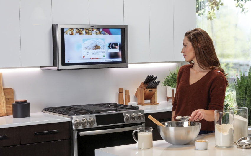 Image source: https://www.homecrux.com/ge-kitchen-hub-smart-range-hood-with-27-inch-display/116042/ Smart Bathrooms Bathrooms of the future are smarter, cleaner, and sleeker. The biggest smart home trends are integration with artificial intelligence (AI) that connect via your smart phone or reader. These have additional customization choices that can benefit our mental health and overall well-being. Here are some of the top tech options you can expect to see in bathrooms of the future. Smart Toilets Many smart toilets have features like seat warmers, touch-free automatic lids, night lights and even speakers for your favorite music. It’s today’s parallel to yesterday’s “private library”. Smart toilets are more compact and better designed than traditional toilets, so they take up less space. Since they’re touch-free, they're also more hygienic and many are self-cleaning. Check out the Kohler line of “intelligent toilets here! 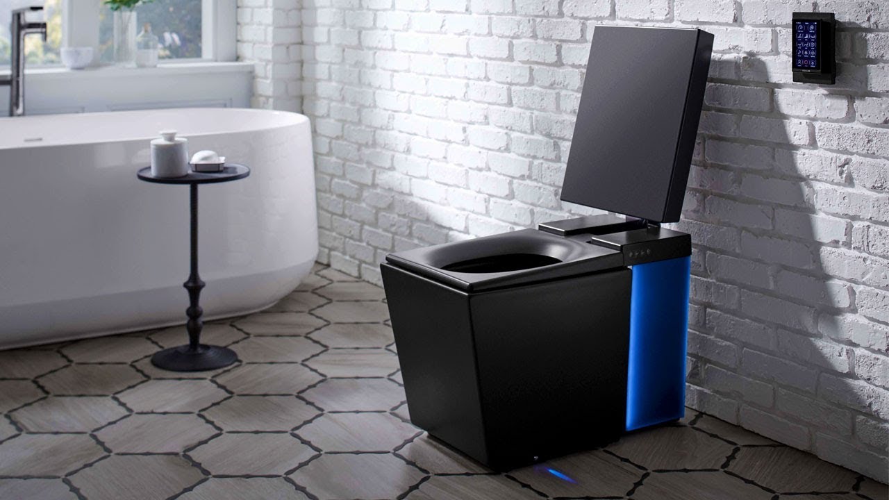 Image source: https://www.architecturaldigest.com/story/kohler-numi-smart-toilet-amazon-alexa-craziest-launch-at-ces Interactive LED Mirror An interactive LED mirror (or smart mirror) has a built-in display for things like time, traffic reports, weather forecasts, news updates, reminders and appointments. You can ask your mirror questions and control other smart devices in your home. (That’s in case you want to know how to make a cake while you’re brushing your teeth.) Check out the Gesipor Smart Mirror here!  Image source: https://www.kickstarter.com/projects/743717037/eve-smart-mirror-interactive-smart-mirror-with-an Privacy glass Adjustable privacy glass allows you to change between transparency and opacity in your bathroom windows. The glass has a natural opaque look and provides total privacy, but it lets natural light pass through. You can change your glass from clear to frosted or set automatic controls using your smartphone or voice assistant. Adjustable privacy glass can give your smart bathroom a clean modern feeling, plus add privacy, versatility, energy efficiency and more hygiene than traditional privacy options, such as curtains or traditional glass, and it’s easier to clean. 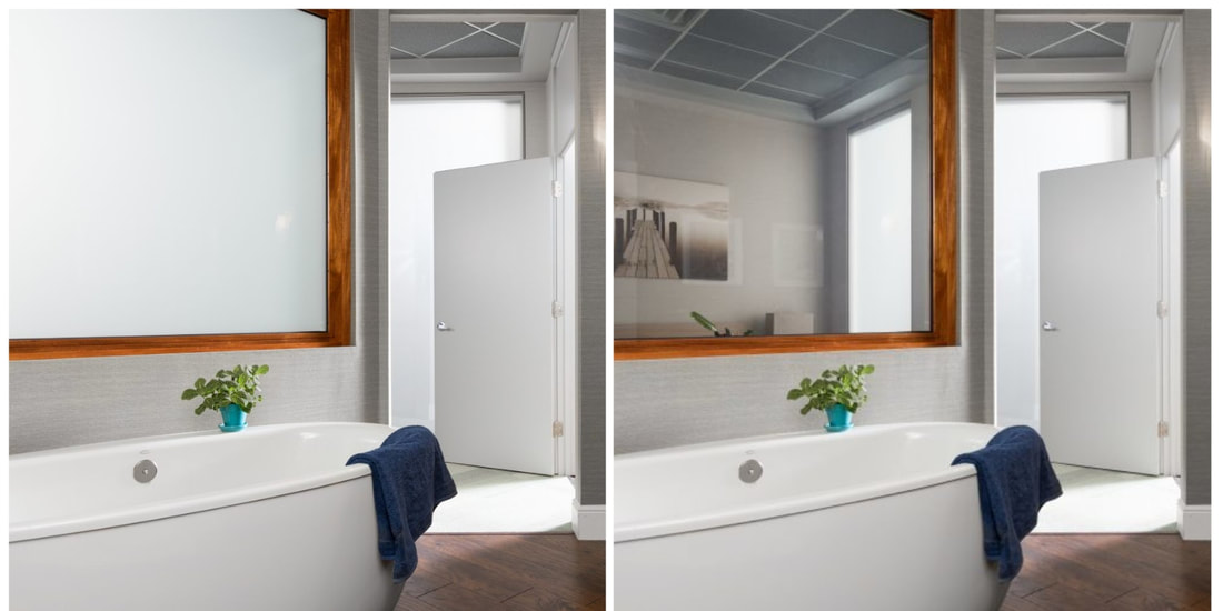 Image source: https://polytronixglass.com/products/polyvision/ Smart Shower A smart shower allows you to set the water temperature, flow rate, shower time and more through your smart device. The main benefits of smart showers include consistent water temperature, more safety, remote control and water and energy savings. These showers even use a thermostat to keep a steady water temperature and prevent sudden changes. Check out the smart shower options from Moen here! 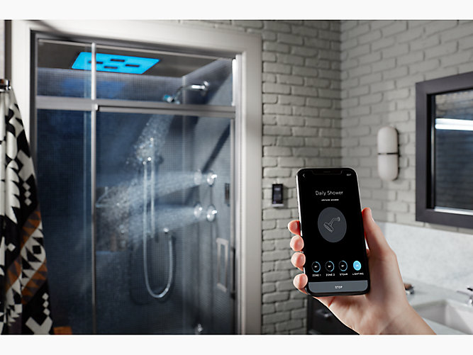 Image source: https://www.kohler.com Chromatherapy Lights Chromatherapy lights are high-intensity LED lights you can control digitally (typically with a simple remote control) and change the setting you want such as romantic or relaxing. Most devices come with multiple color options, intensity and brightness settings. You can combine chromatherapy lights with aromatherapy, sound therapy, thermotherapy and hydrotherapy to create a relaxing spa experience right in your own bathroom. 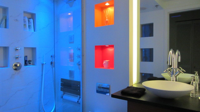 Image source: https://www.houzz.com/magazine/bath-design-renew-body-and-mind-with-colorful-light-stsetivw-vs~6963681 Smart Scale If you’re looking for more ways to focus on your health, then a smart scale can make it easier to track your fitness and wellness goals. A smart scale not only measures and records your weight, but information such as body composition, body fat percentage, muscle mass, resting heart rate, water percentage and bone mass. Smart scales can track and store data and sync with other smart devices, like fitness trackers or smartphone apps, to ensure you reach your fitness goals. Check out the Withings Smart Scale here! 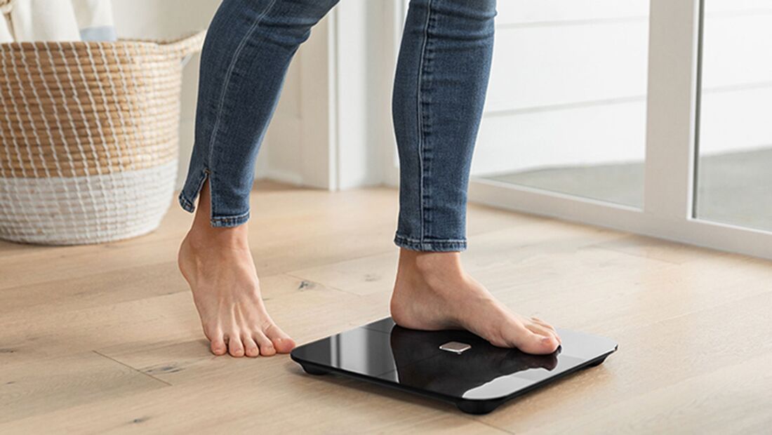 Image source: https://www.cnn.com/cnn-underscored/reviews/best-smart-scale Smart Water Assistant A smart water assistant is a water monitor that helps you save water and money and integrates with voice assistant or smart phone for easy control. Not only will it provide detailed insights into how you use water, but you’ll also get regular reports, so you're aware of your water usage. This tool also enables you to avoid leaks in your home. Plus, when a leak is detected, you’ll get an SMS or push notification to address it quickly. Check out the Moen Flo Smart system here! 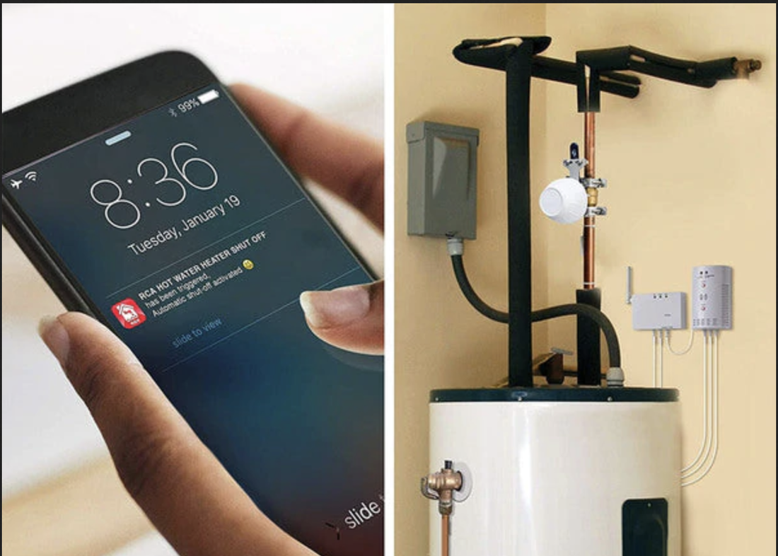 Image source: https://owensassetfundgifts.com/ Rethinking your kitchen and or bathroom space provides an opportunity to address issues of convenience and efficiency, controlled by smart devices, as well as entertainment and communication options. Call me to see how you can get the most out of these choices and “get smart” technology. As Lyons-Archer Kitchen and Interior Design celebrates its 11th anniversary this year, I am proud to have created a design firm that offers a unique, curated kitchen design experience. I carry River Run stock cabinetry, Prodigy and Woodland semi-stock cabinetry, and Prevo custom cabinetry, so I can provide an individualized design, purchase and specification process for the discerning client.
Please contact me for other services, including bathroom and office design, space planning, couture draperies, window coverings and upholstery. I can be reached at [email protected], or at 215-860-5059! #lyonsarcherkitchenandinteriordesign #Prevocabinetry #kitchendesigner, #kitchen cabinets #bucks_county_cabinetry_dealers #Riverruncabinetry #Prodigycabinetry #kitchendesign #Woodlandcabinetry #cabinet_dealers_bucks_county_PA #lyons_archer_kitchen_and_interior_design Do you know that, annually, Americans lose about two-thirds of the 760 million pounds of wasted food to spoilage and that fruits and vegetable are the most vulnerable? Now, refrigeration technology can come to the rescue, based on what I saw at the Kitchen and Bath Industry Show (KBIS) in Florida; the trade show was held at Orlando’s Orange County Convention Center, from February 7 to February 10, 2022. For example, “Ever Fresh+” a new feature in BEKO refrigerators combines sophisticated temperature and humidity control to keep veggies and fruits three times fresher than other cold storage. “Active Blue Light Technology” complements Ever Fresh+ by stimulating photosynthesis in veggies and fruits, thus maintaining their vitamin and nutritional value during storage—not to mention their color. Speaking of color, Color was THE theme at this year’s KBIS General Electric’s (GE) Café brand exhibit comprised four kitchen vignettes to highlight upcoming kitchen appliance and design themes. All were inspired by runway fashion color trends. For example, the “Bold Ambition” vignette was influenced by the indefatigable textile doyenne and recently signed fashion model Iris Apfel. And did I mention she’s a spritely 100 years young? 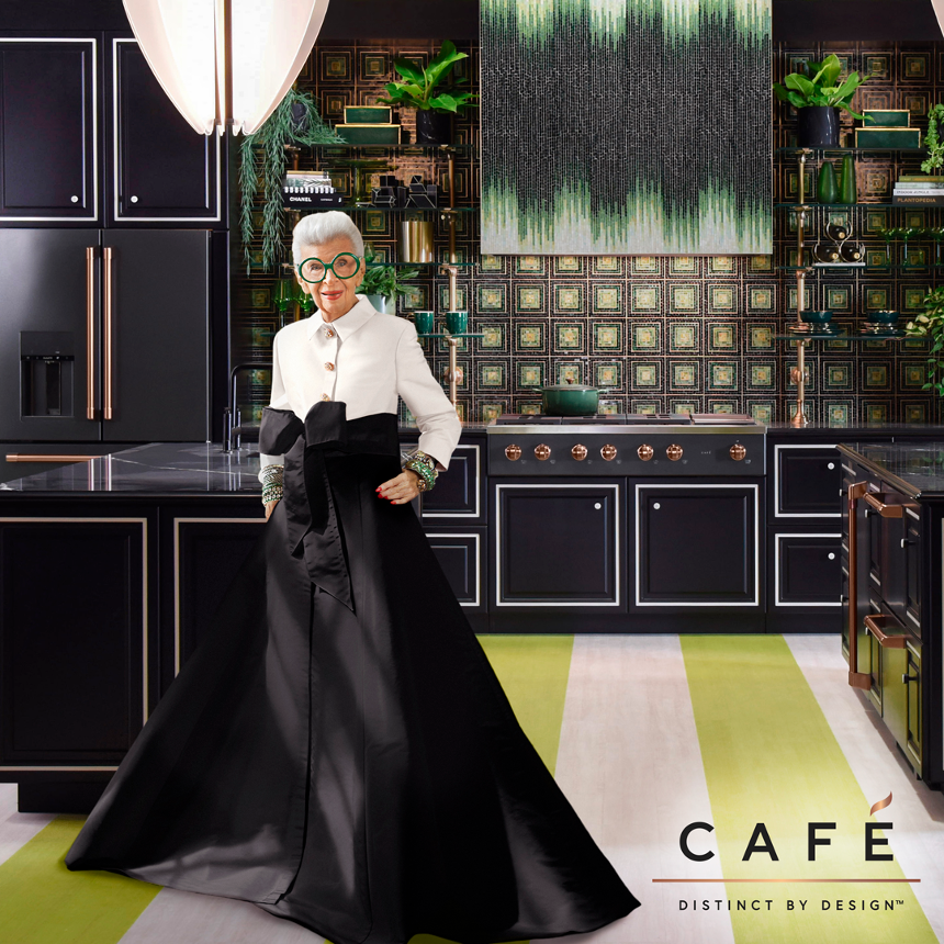 Bold Ambition paired black with a bright true green—I’m guessing Pantone 16-6340, Classic Green—Black appliances and cabinetry were accessorized with coppery fixtures and hardware and were a perfect complement to the botanical theme. GE debuted drawer products, such as a microwave and dishwasher. 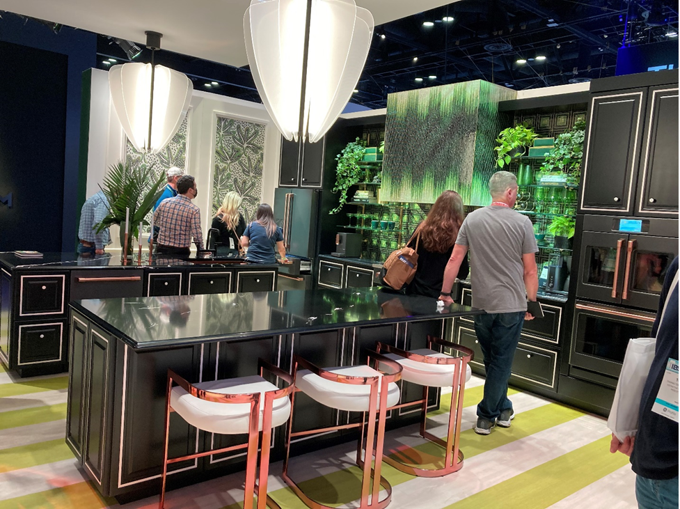 “Fearless Energy” used sunny, ‘70s colors and free-spirit attitudes to showcase a four-door French door fridge and a 48” dual fuel range. 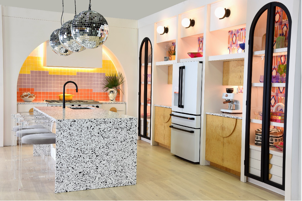 GE also introduced its entry into countertop appliances, such as an espresso coffee maker and toaster. 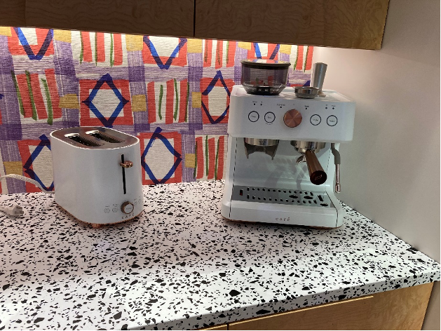 From the extravagant to minimalist—on to the Haier booth. Haier, a Chinese multi-national company that owns 90 percent of General Electric, exhibited scaled-down appliances, suited to a smaller house or an urban dwelling. Its products are targeted to the 25–40-year-old market, according to one of the company representatives. Enjoy the brief tour of the layout and call me for any questions or comments. I’m happy to share more about the show. To view more click here: https://www.haierappliances.com/haier-appliances-KBIS-2022 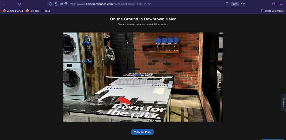 As Lyons-Archer Kitchen and Interior Design celebrates its 10th anniversary this year, I am proud to have created a design firm that offers a unique, curated kitchen design experience. I carry River Run stock cabinetry, Prodigy and Woodland semi-stock cabinetry, and Prevo custom cabinetry, so I can provide an individualized design, purchase and specification process for the discerning client.
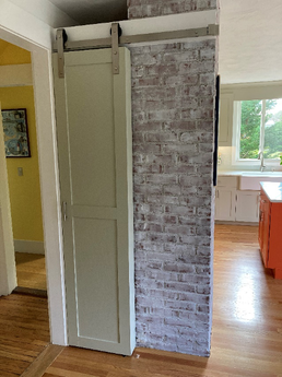
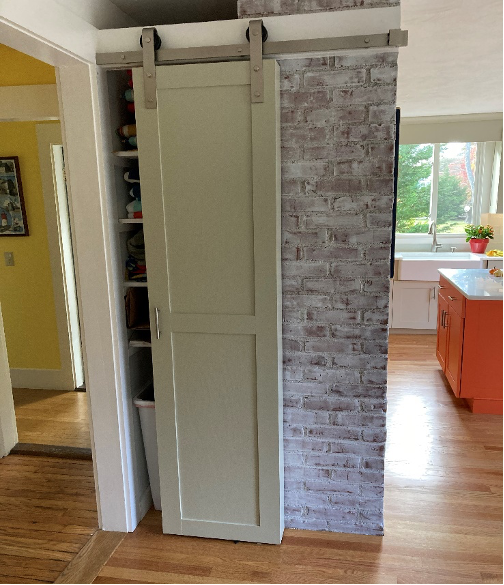
Please contact me for other services, including bathroom and office design, space planning, couture draperies, window coverings and upholstery. I can be reached at [email protected], or at 215-860-5059! #lyonsarcherkitchenandinteriordesign #Prevocabinetry #kitchendesigner #kitchen cabinets #buckscountycabinetry #Riverruncabinetry #Prodigycabinetry #kitchendesign #GECafé #Haierappliances #Woodlandcabinetry 2021 is a wrap, and while it was better than 2020, I am looking forward to 2022. Before we close the door completely on this year, I’d like to share a project in Cape Cod that I recently finished---and an unbelievably delicious recipe from my site visit there, just in time for the holidays. About the house… Built in the mid-1930s, the Arts and Crafts home in Orleans, MA was a year-round home prior to the current owner’s purchase. “We quickly renovated the kitchen with stock cabinetry and Formica countertops to prepare the house for seasonal rentals, “says the owner, a former Washington DC-area resident. “And so it remained for about 20 years—functional enough for a rental property.”  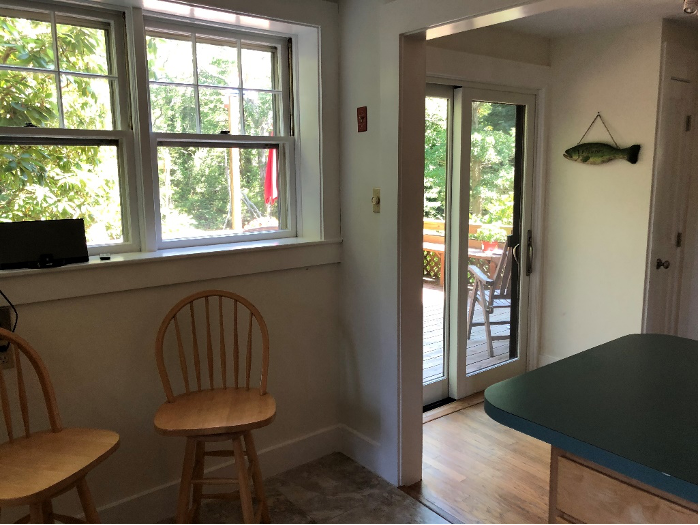 “When COVID struck, I re-evaluated my work and living situation and decided to make Orleans my permanent residence,” she says. “Since I would be living there full-time, I wanted to take my kitchen from being strictly utilitarian to high-end.” The client’s specifications included: -all-new, professional-grade appliances, comprising 36” wide gas range, a refrigerator/freezer, dishwasher, and an upgraded ventilation system -a cabinet style to compliment the home’s Arts and Crafts aesthetic -Benjamin Moore’s Spanish Olive for the perimeter and Fiesta Orange as an accent color (the owner loves bright and cheery orange!) -direct access to the outside deck from the kitchen -top-quality countertop surface and sustainable backsplash material -improved lighting -increased storage within the existing kitchen footprint -improved ventilation that could handle every day and heavy holiday cooking 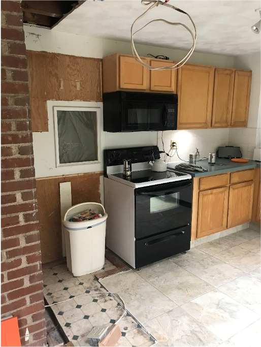 Removing this unused pass through provided space for a new luxury appliance. Meeting and Beating the Client’s Brief… I specified custom cabinetry from Prevo Cabinetry, Ephrata, PA, to meet the client’s request for specialized colors and for maximum dimensional flexibility. The client chose 2-1/2” solid wood flooring to match the wood floors throughout the home. “I wanted to have a seamless look throughout the house and also I preferred wood flooring to porcelain tiles because wood is easier on the back and knees.” As part of the design, we relocated and changed some of the kitchen’s existing fenestration and openings. The wall-hung windows on the wall perpendicular to the sink and facing the deck area were replaced with sliding glass doors. The double windows over the sink were reduced to one, which resulted in more space for wall cabinets. 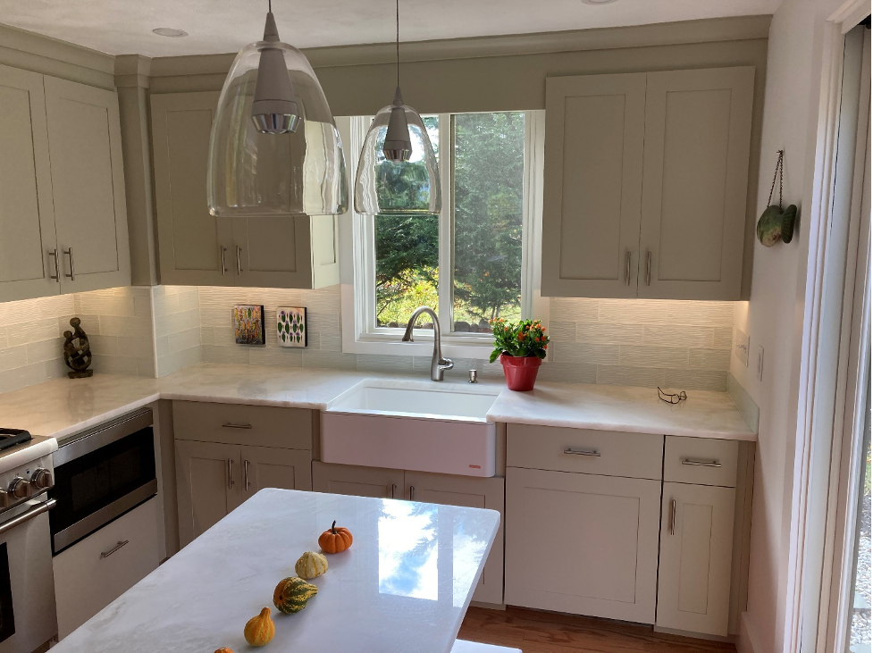 Wall cabinet size was increased from 30” high to 36”, and a farmhouse sink complemented the understated Shaker-style cabinetry. An unused pass through between the kitchen and the hallway behind it was sealed; the resulting solid wall became the location for the Wolf counter-depth refrigerator. Other appliances were re-positioned to allow additional wall and base cabinet storage and visual symmetry. 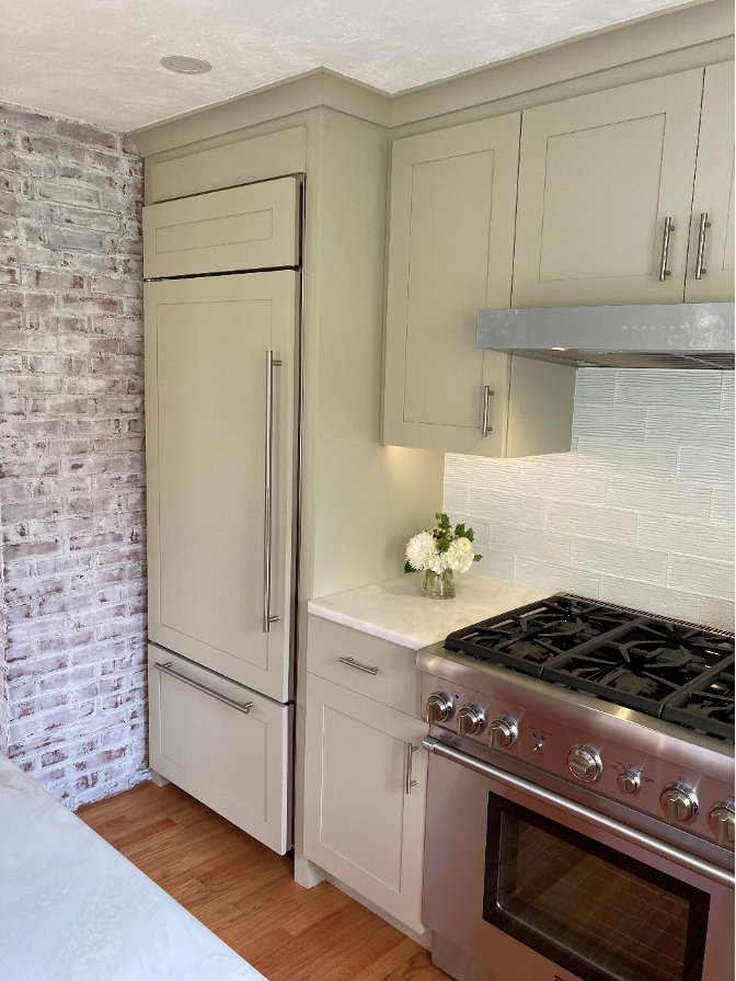 The brick wall, to the left of the refrigerator was retained for structural reasons. And the open shelf it housed on the opposite side, facing the center hall, became a closed pantry with a barn door, custom-made by the installer to match the cabinetry.
All base cabinets featured soft-close rollout shelving, and an under-the-sink pivot waste container provides efficient trash disposal. 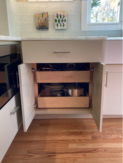 The island supports an overhang on the exterior long side and on the left. This enables guests to chat with the client as she cooks and serves. 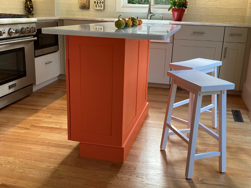 The island features added storage for the client’s small appliances. Plus, it’s a great piece for injecting that shot of the splashy Fiesta Orange the so reflects the client’s bright personality. 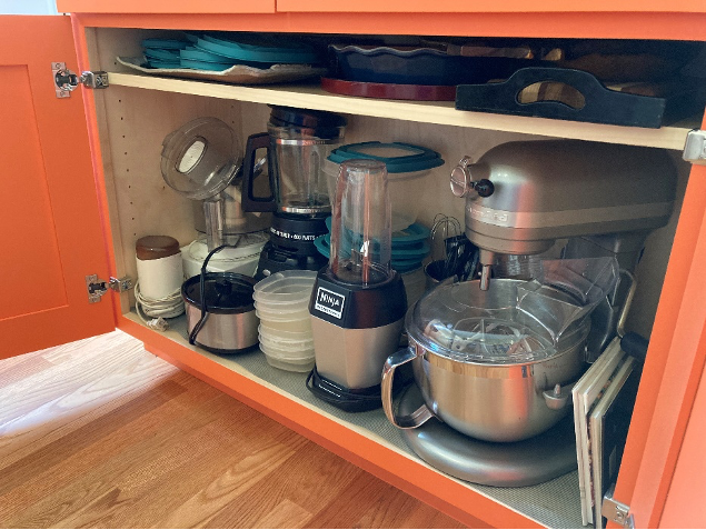 The old, over-the-range microwave was replaced with a Sharp SMD2489ES drawer microwave and doubles as a warming oven as needed. 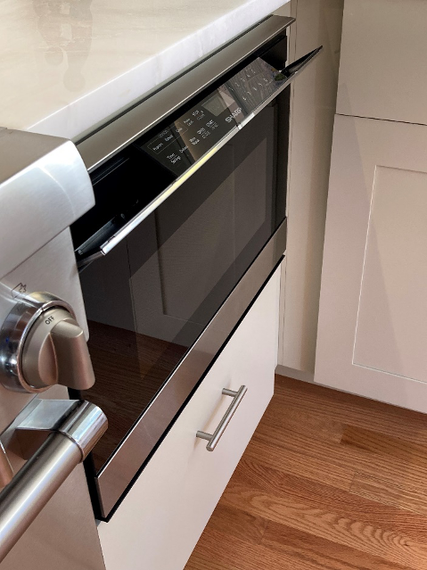 The newfound space over the range houses a BEST USCB3 ventilation unit which could now be vented to the outdoors. Because of the kitchen’s size, it was very important to specify an efficient fan that could handle a variety of cooking fume levels. With a range of 160 CFM to 500 CFM, the fan meets these requirements very well. LED strip lighting replaced the old fluorescent fixtures---a big improvement in task lighting, and nice way to highlight the back splash. 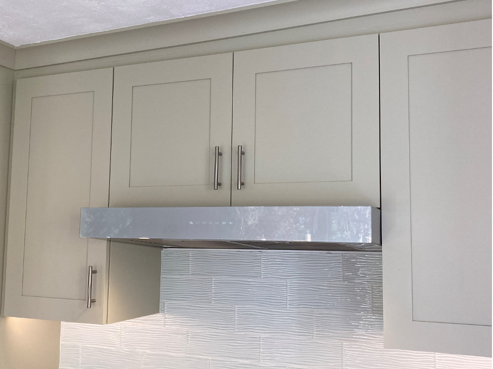 The back splash’s recycled subway tiles, with its undulating motif, complement the polished marble countertop and recall the home’s seaside proximity. 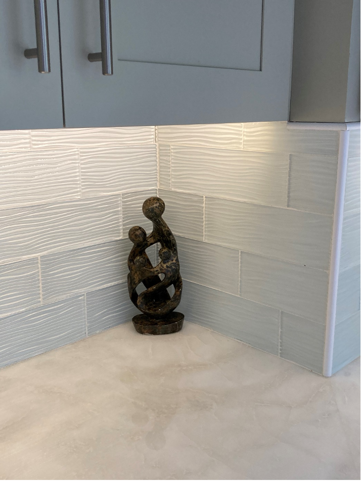 “’Wow’ is what my neighbors and guests say when they see the new kitchen,” says the owner. “Tina considered every detail and could only do so with a cabinet company that could also fulfill my particular needs and the style of the house.” She loves the results, stating that the kitchen is her favorite room in the house! The client has shown her appreciation in countless ways, the most recent being a gift of freshly harvested cranberries from PJ Cranberries, a local Cape Cod grower. The locally native fruit came with an interesting cranberry bread recipe that I want to share with you. Enjoy it this holiday season, with my sincere good wishes! Here’s to a better 2022!  PJ Cranberry Bread
2 cups fresh cranberries 2 teaspoons vanilla 1-2/3 cups sugar 4 eggs 2/3 cups vegetable oil 3 cups all-purpose flour ½ cup milk ½ cup coarsely chopped walnuts 2 teaspoons grated 4 teaspoons baking powder Orange or lemon peel 1 teaspoon salt Heat oven to 350 degrees. Grease bottom of 2 loaf pans (8-1/2” x 4-1/2” x 2-1/2”, or 9” x 5” x 3”. Mix cranberries, sugar, oil, milk lemon peel, vanilla and eggs in large bowl. Stir in remaining ingredients. Pour into pans. Bake 50 to 60 minutes or until toothpick inserted in center comes out clean. Cool 10 minutes. Loosen sides of loaves from pans; remove from pans. Cool completely on wire rack before slicing. Store tightly wrapped in refrigerator up to 1 week. Note: Here are a couple of hints/substitutions you may want to consider. Measure out and mix all dry ingredients in a large bowl; add one tablespoon at a time to the mixed wet ingredients. Mix well between each addition. I substituted chopped pecans for the walnuts. Warm milk slightly prior to adding. For a gluten-free version, use King Arthur’s Measure for Measure flour. As Lyons-Archer Kitchen and Interior Design celebrates its 10th anniversary this year, I am proud to have created a design firm that offers a unique, curated kitchen design experience. I carry River Run stock cabinetry, Prodigy and Woodland semi-stock cabinetry, and Prevo custom cabinetry, so I can provide an individualized design, purchase and specification process for the discerning client. Please contact me for other services, including bathroom and office design, space planning, couture draperies, window coverings and upholstery. I can be reached at [email protected], or at 215-860-5059! #lyonsarcherkitchenandinteriordesign, #CapeCodkitchendesign, #Prevocabinetry, #buckscountykitchendesigner, #kitchen cabinets, #buckscountycabinetry You’ve set money aside, poured over kitchen design magazines, and maybe ventured into a home show, or two, or three. Still, you aren’t quite sure you want to attempt that kitchen renovation just yet. To help you along, we’ve compiled five scenarios to help you decide if a kitchen renovation should be in your near future. 1. You and your family eat in shifts because your counter or kitchen table can only accommodate a few diners at a time.  Image source: istockphoto-640957946-612x612.jpg?1635370273 Image source: istockphoto-640957946-612x612.jpg?1635370273 With our frenetic schedules, it’s imperative that available family dinner time is comfortable and safe. If you find that space constraints are limiting cooking or dining, it's time for a kitchen renovation or an expansion. And, with increased sensitivity to COVID and other infectious diseases, more homeowners are hosting guests, instead of eating out, thus requiring more space for them. The space requirements need not be exorbitant. Forty-two percent of people who plan to increase their kitchen’s size intend to expand it by 25 percent or less, while 40 percent plan to increase size by between 25 to 49 percent, according to a recent National Kitchen and Bath Association (NKBA) designer survey. If space constraints are limiting cooking or dining, it's time for a kitchen renovation or an expansion. Increasing the square feet of a kitchen doesn’t necessarily mean building out into your yard. Your kitchen may be hemmed in by a breakfast area, an underutilized laundry room or a closet. These areas could be repurposed into additional kitchen space. 2. You’ve got a new member of the family.  Image Source: https://farm4.staticflickr.com/3382/3338124183_52c40c0d98_z.jpg?zz=1 Whether it’s a new baby or elderly parent(s), a new person in the house requires a review of your kitchen. It might be time to update your appliances and lighting. While the microwave over the range has served YOU well, a small child or a mature person with less mobility risks a scalding injury if their hands are unsteady. Today’s drawer microwaves permit easy operation with large displays and controls and ease of inserting or removing food from the drawer. Some models can be installed at a height slightly above the counter, in a tall cabinet, in case bending forward is an issue. Yesterday’s puck lights can create poorly illuminated areas on the counter leading to issues of cleanliness and visibility when chopping or cutting. LED strip lights illuminate the entire countertop, are brighter and operate cooler, meaning they do not contribute to ambient temperature when they are on.  Image source: https://www.dwell.com/search/Lighting/photos/6244516717211176960 3. You store your Costco purchases in the hallway coat closet, or the basement. 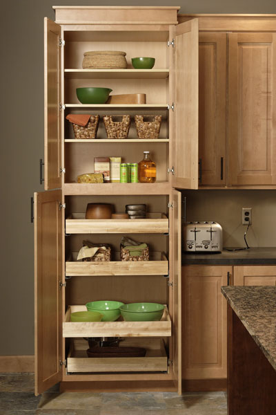 Image source: https://www.cliqstudios.com/images/cliqstudios-mendota-caramel-tall-pantry-cabinet-open-400x600.jpg Most of my clients are removing the builder’s grade, static shelf, pantry closets, in favor of cabinet built-in pantries that feature soft-close, roll-out shelves and efficient storage. Depending on your ceiling height, your cabinet pantry should feature at least two shelves above the roll-out drawers to store those Costco items you just couldn’t resist. 4. You like to socialize with guest while you cook, and your children like to do homework in the kitchen.  Image source: Food photo created by Racool_studio - www.freepik.com Seemingly two separate functions, this indicator means you need a versatile island. Charging stations or pop-up outlets for the family’s electronic devices, a structure that encourages conversation but keeps guests and small children at safe distances, and space for a second dishwasher, under counter drawer fridge or auxiliary sink are all features a sleek island can accommodate. In fact, consumers often cite a desire to have an open concept, multi-function, top space and removing the traditional table as reasons to eliminate non-weight bearing walls, so they can have a large island that accommodates many needs, according to the NKBA survey.  Image source: editmysite.com/uploads/2/3/9/1/23919615/editor/doing-homework.jpg?1635370286 Image source: editmysite.com/uploads/2/3/9/1/23919615/editor/doing-homework.jpg?1635370286 .5. You are tired of cleaning all the nooks and crannies on your beat-up cabinets. Perhaps in times past, people had time to dig out the dust and kitchen grime on their elaborate kitchen cabinetry. Us? Not so much Even homeowners with traditional homes are opting for cabinetry with less details that can minimize everyday dirt build-up. The “greening” of America means that today’s kitchen owners are seeking European, minimalist cabinetry. It’s easier to clean. The most sought-after looks will incorporate toned-down detail, painted or laminated finishes, with natural accents in the cabinetry, backsplash or countertops. This is especially important if you are considering selling your home within the next three years or so. 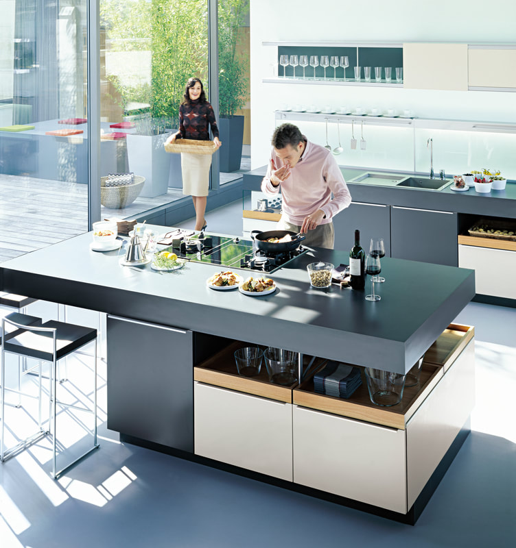 Image source: http://www.theenglishroom.biz/wp-content/uploads/2013/09/plusmodo_1_07.jpg Are you ready to jump in? Give me a call for a consultation; we’ll discuss your needs and how we can provide the solutions, including design services, and cabinetry products from USA-made stock, semi-stock and custom manufacturers. As Lyons-Archer Kitchen and Interior Design celebrates its 10th anniversary this year, I am proud to have created a design firm that offers an unique, curated kitchen design experience.
I carry River Run stock cabinetry, Prodigy and Woodland semi-stock cabinetry, and Prevo custom cabinetry--all products made in the United States. Working with me is an individualized design, purchase and specification experience for the discerning client. Please contact me for other services, including bathroom and office design, space planning, couture draperies, window coverings and upholstery. I can be reached at [email protected], or at 215-860-5059! Kitchen renovations are a major undertaking which you should attempt only after careful planning; otherwise, your dream project can quickly turn into a nightmare. Renovations take time, space, as well as money. So, you'll need a well-planed schedule to stay on track and smart strategies to help you live relatively comfortably with less square footage, temporarily. Preparing meals is one of the biggest challenges you'll face as your appliances are not always available. Whatever your needs, compact countertop appliances can help you survive your kitchen renovations without breaking the bank. With that in mind, here are some of our favorite all-in-one appliances that can help you survive a renovation. 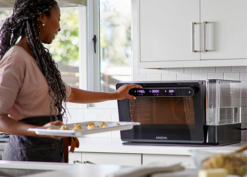 Anova Precision Oven All appliances say they do it all, but this one may actually deliver! It is truly a marvel of countertop appliances. You can bake, broil, roast, dehydrate, or accomplish any other dry heat cooking method you'd expect from a normal oven. Combi ovens use precision temperature settings, paired with the controlled injection of steam, to create an ideal cooking environment. Until recently, combi ovens could only be found in commercial kitchens due to high price points and space needed to house them Now you can take advantage of the power and precision temperature control and steam from home to achieve chef-quality results. 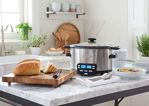 Cuisinart 6 qt. 3-in-1 Multicooker Mulitcookers have evolved from your mother's "crock pot" into multi-functional marvels. The Cuisinart 6qt. 3-in1 Multicooker features Cook Central technology that makes cooking for family and crowds simple; three preset functions will allow you to sauté, steam, and slow cook any recipe to perfection. The convenient "Keep Warm" feature comes on once the cooking is complete, so you never have to worry about serving cold dishes at dinner time. And when your meal is over, the removable cooking pot is nonstick and dishwasher safe for effortless cleanup. 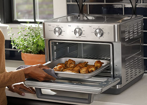 GE Mechanical Air Fry 7-in-one Toaster Oven The GE Mechanical Air Fry Oven is a moderately priced combination toaster oven and air fryer. It features seven cooking modes that include air fry, toast, warming, broil, roast, and convection. The convection mode allows you to achieve golden results every time. It's advanced technology circulates the heat and provides an even bake. In fryer mode you can enjoy your favorite dishes without the "caloric penalty" -thanks to an electric air fryer mode built right into the toaster oven. Cleanup is easy with a removable toaster crumb tray at the bottom of the toaster oven. 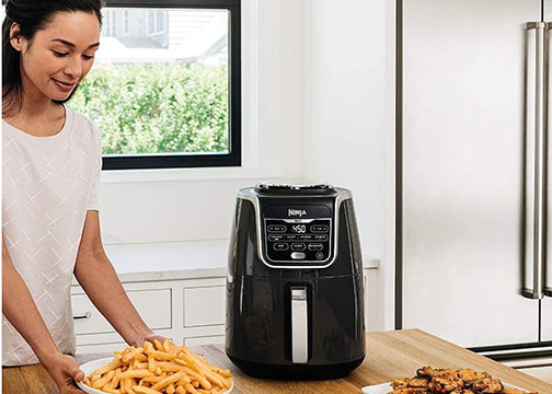 Ninja 5.5qt. Air Fryer Max
Ninja is a relatively new brand in the small appliance market specializing in products that allow you to get better, faster results. Functions include: air fry, air roast, air broil, bake, reheat, and a unique dehydration option. Featuring max crisp technology, the Ninja delivers 450 degrees of super-heated air to cook foods up to 30 percent faster than other brands for hotter, crispier results with little to no oil for guilt free fried favorites. Additionally, the Ninja features a ceramic coated basket that is nonstick and dishwasher safe, to make clean -up quick and easy. Regardless of your budget or your needs, these multi-functional appliances will help your family survive a kitchen renovation one meal at a time. Bon Appétit! Our natural connection… Most humans feel connected to nature in a very deep way. We envision warm sandy beaches, a stroll in the woods or along mountain streams, to calm and center us. Interior designers have always understood the connection between nature and design - to enhance the look and feel of a space that connects us to the natural world. It is a simple truth humans need a feeling of connectedness with nature to not just survive but to thrive. What is Biophilic Design? Biophilia (meaning love of nature) focuses on humans’ innate attraction to nature and has existed for thousands of years. It suggests we all have a genetic connection to the natural, and Biophilic Design is all about recreating that relationship between humans and nature Interior designers use Biophilic Design principles to create a human-centered approach to interior design. When applied, these principles improve many of the spaces that we live and work in today, providing numerous benefits to our health and well-being. Incorporating direct or indirect elements of nature into your space has been proven to reduce stress while increasing productivity, creativity and sense of well-being. In recent years leading businesses such as Apple, Google, and Amazon, have invested heavily in Biophilic Design to improve worker concentration, engagement, and cognitive ability. The incorporation of Biophilic Design has also gained popularity in the hospitality sector, with guests reportedly paying up to 23% more for rooms with views of Biophilic elements. In the retail sector, the presence of vegetation and landscaping has been found to increase average rental rates on retail spaces, with customers willing to pay 8-12 % more. How can I incorporate Biophilic Design in my own home? The benefits of Biophilic Design can extend to our homes, which can become more calming and restorative. There are six main features to consider when it comes to using Biophilic Design techniques in your home: 1. Using elements that reflect the natural world Features of the natural world can be incorporated into your space to create a more natural feeling environment. Simple things like earthy colors, sunlight, plants, and animal and nature images are simple but effective ways to bring a sense of connection to nature into your space.  2. Natural Shapes Natural shapes are forms that are inspired by or occur in nature. Some examples include arches and vaults, shelving made from natural materials like stone or bamboo, water features, and other decorative elements that mimic natural elements. 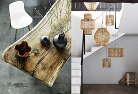 3. Natural Patterns Similar to natural shapes, natural patterns and/or processes occur in nature. Examples include a surface that appears naturally distressed, plants in rustic containers, and the use of rhythm and scale with natural materials or elements such as stone. 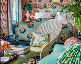 4. Natural Light Sunlight as a Biophilic Design strategy puts an emphasis on light and space. Light helps merge the inside and outside using elements of warmth and different shapes. This could also be combined with window treatments made of natural materials to bring a sense of connectedness between the outside and inside. 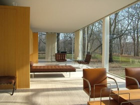 5. Plants Perhaps the most direct and simple way to incorporate Biophilic Design principles in your space is the use of plants. You can focus on the use of real plants, imagery, or plant colors with other natural materials outside the home to create a sense of flow throughout a space. The idea here is to create a relationship between the space and the natural elements it is incorporating. 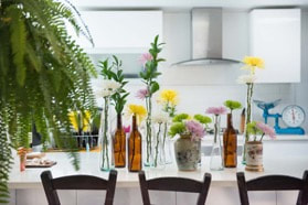 6. The Human-Nature Relationship
Above all, Biophilic Design elements should stimulate more than just our visual senses, they should be restorative, uplifting and calming. Regardless of what techniques you use in incorporating direct or indirect elements of nature into your space, the goal is to allow the natural world to bring you a sense of well-being. It’s Called Connection Have you ever walked into a perfectly appointed room AND. IT’S. JUST. LIFELESS? The color scheme works, the furniture is right, the décor and supporting architecture works – but the space still feels somehow flat or it is missing that ‘special feeling’ or ‘connection’ that makes it unique. Usually, the reason is a lack of design texture. A Defining Factor A trained interior designer knows that textures and surfaces are the very thing that make a room memorable and unique. Effectively using textures is a defining technique that elevates design to the next level. What exactly do interior designers mean by “texture”? In interior design terms, texture is defined as, “the sensations produced by surfaces of objects when touched.” Think about the feeling when walking across a soft carpet as the shag surface tickles your toes, running your hand along a rough-hewn railing, or cuddling up on your billowy soft couch with your favorite blanket. You don’t even need to have physical contact with a room to feel the power of texture. We all have an intimate deep connection to our “sense of touch” and associations with how something feels. Texture plays much more than a supporting role in the function of a space. Texture not only brings a sense of completion to a space; it’s what makes something feel like home and is vital to a design’s success. Think of it this way, imagine trying to cuddle up for movie night on a sofa made of stone."Consider how texture will elevate the overall experience of your design, and how it makes you feel within that space." Texture can add some weight to your space Using texture to add some visual weight to a space simply means that an object – or space as a whole – has the ability to draw attention to itself. Rough textures for example, are more likely to make a space feel intimate or familiar while slick, smooth textures can make a room more aloof. I always consider the placement of textures as I design a space. If I want to highlight a rough texture, I will often put a smooth texture directly next to a rough one. It will make the rough object stand out more and give it a weightier feel than if I space them apart. Balancing Textures Contrast is essential when it comes to design; it maintains a sense of balance and also provides visual interest. If everything is too similar, the room seems flat or uninteresting. Using texture is a great way to make sure the most important elements pop. But, try not to go too texture-crazy; it’s important to strike a balance. I often stick to two or three distinct textures in any given space. I choose three when I want people to take in the space as a whole and two when I want to emphasize a prominent focal point. Texture is even more important if you’re working within a color palette where the shades are very similar. When I’m designing with a monochromatic or analogous color scheme, I choose items that provide a heavy contrast. This will bring a sense of harmony to the space. OK great, but what can I do at home using texture? It doesn’t always take a total redesign to employ the uses of texture to enhance your space. Here are a few simple ways you can use texture in your space:
A lifeless room… Here’s an example of a lifeless room; however 2001: A Space Odyssey was a good movie!  Good use of texture… This room embodies good use of texture; it exudes warmth and contrast. The rough textured band on the wall is an appropriately scaled accent. 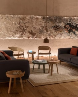 Textures for a New Kitchen Design... Here is a mood board for a kitchen I am designing, using the Prodigy brand of semi-stock cabinetry I carry. The wood grain cabinetry for the island contrasts with the smooth white finish chosen for the perimeter cabinets. The window treatment textile, the countertop and the metal screen provide interest visual interest and texture. 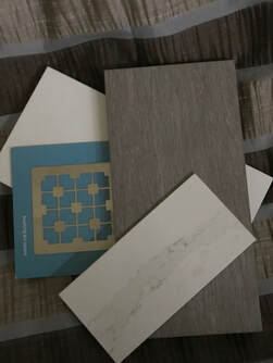 Too much texture... While a good proportion of texture can add interest to a space, it’s important not to overuse it as shown here. This room lacks any place for visual rest.  As Lyons-Archer Kitchen and Interior Design celebrates its 10th anniversary this year, I am proud to have created a design firm that offer a unique, curated kitchen design experience. I carry River Run stock cabinetry, Prodigy and Woodland semi-stock cabinetry, and Prevo custom cabinetry, so I can provide an individualized design, purchase and specification process for the discerning client.
Please contact me for other services, including bathroom and office design, space planning, couture draperies, window coverings and upholstery. I can be reached at [email protected], or at 215-860-5059! Kitchen cabinets are the focal point of your kitchen. Choosing the right cabinet can make or break the look you are trying to achieve. So, where do you begin? With a bewildering number of choices and options, here are some considerations. Not all cabinets are created equal! Cabinets fit into three broad categories, stock, semi-custom and custom. Each type has its strengths and limitations, and here are a few:
The bottom line – regardless of the cabinet level you choose, make sure your purchase meets industry standards, so you enjoy maximum durability, beauty and return on your investment. How KCMA Separates the Good from the Bad Confirm that the cabinets you intend to buy meet standards established by the Kitchen Cabinet Manufacturers Association (KCMS). Look for a KCMA label on the inside of a stock or semi-stock cabinet door. Ask custom cabinet manufacturers if they meet KCMA standards. Established in 1955, KCMA is the recognized education and research leader in the cabinet industry. The KCMA has a five-point durability test all cabinets must meet to earn the KCMA stamp of approval. The tests measure cabinet/shelf strength, drawer slide and hinge durability, finish stability, and the ability to withstand temperature changes and high heat. There are three weight tests that measure the strength of cabinet shelves, joint integrity, wall cabinet load bearing capacity, and a cabinet bottom’s ability to sustain common kitchen impacts, such as dropped cans. How Cabinetry Addresses Sustainability and Safety In recent years manufacturers and interior designers have worked together to develop products with an eye on sustainability and safety guided by the Environmental Stewardship Committee Certification (ESC). Established in 2006, cabinet producers meet standards for manufacturing:
The Formaldehyde Question… Designers get a lot of questions about the relative safety of formaldehyde a naturally occurring substance in plywood, an integral product in cabinet making. Its effect on health is still being hotly debated, however, here are some important issues you need to be aware of when dealing with wood products:
Final Thoughts Keep in mind that out of your estimated budget for kitchen remodeling, typically 30% -40% of your budget will be allocated to the kitchen cabinets Although bargains are possible, short-term cost savings may mean you sacrifice the quality and service you deserve in the long run. Whichever approach you choose, it’s important to consult an experienced kitchen design professional like Lyons-Archer. We can guide you through issues of Sustainability / Safety, Quality, Style and Savings to ensure you create the kitchen of your dreams. As Lyons-Archer Kitchen and Interior Design celebrates its 10th anniversary this year, I am proud to have created a design firm that offer a unique, curated kitchen design experience. I carry River Run stock cabinetry, Prodigy and Woodland semi-stock cabinetry, and Prevo custom cabinetry, so I can provide an individualized design, purchase and specification process for the discerning client. Please contact me for other services, including bathroom and office design, space planning, couture draperies, window coverings and upholstery. I can be reached at [email protected], or at 215-860-5059! Prodigy Cabinetry Prodigy Cabinetry which is carried by Lyons-Archer incorporates ¾” plywood cabinet boxes; its durable door offerings include textured thermo-fused melamine board over MDF. The slab door shown here is Syncron, Ice Cream Shown.  Solid wood slab door Here’s an example of a solid wood slab door from Woodland Cabinetry, which I represent. This particular door is made from solid alder, and highlights the beautiful gentle graining that species provides. It is available in cherry, maple, oak and hickory in a variety of stains, paint colors and glazes. 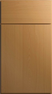 Custom Kitchen This Prevo kitchen is currently underway in a 100-year-old Cape Cod home. With Prevo, I completely customized the cabinetry to meet the home’s special dimensional needs. I also was able to meet the client’s specifications for particular Benjamin Moore colors to match a favorite painting.  |
Archives
November 2022
Categories |
 RSS Feed